ShopDreamUp AI ArtDreamUp
Deviation Actions


Suggested Deviants


Suggested Collections


You Might Like…


Description
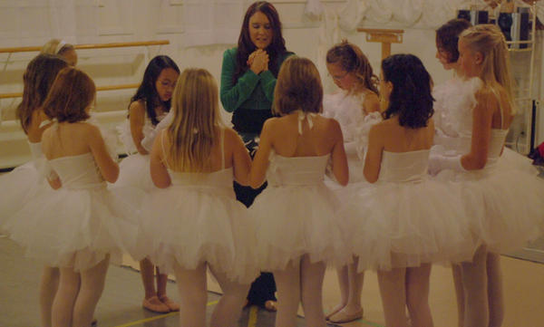
I know this is grainy. Our studio is extremely dark and I have been taught to avoid using the flash at all costs. Is that what I should do or not? Advice would be awesome.
We pray before every class at Messiah Dance Theatre (Smile)")
We pray before every class at Messiah Dance Theatre
Image size
3591x2156px 1.43 MB
Make
NIKON CORPORATION
Model
NIKON D80
Shutter Speed
10/1600 second
Aperture
F/1.8
Focal Length
50 mm
ISO Speed
1000
Date Taken
Dec 11, 2008, 6:33:27 PM
© 2008 - 2024 eyenoticed
Comments12
Join the community to add your comment. Already a deviant? Log In
This is another one from the five you picked I like.
Because:
- the girls in the white dresses. It's rather uncommon view and it's underlined by the numbers of girls
- the interesting moment you caught - again makes me so hard to think, 'what on earth are they doing? praying? singing?'. The good photo always makes you wonder. That's what I believe! <img src="e.deviantart.net/emoticons/s/s…" width="15" height="15" alt="
Now the bad things. <img src="e.deviantart.net/emoticons/w/w…" width="15" height="15" alt="
- sharpness, contrast, the light... They need improvements here and probably just another try. Still these are not a factors that could ruin the photo. I'd say just the little shortcomings.
- the crop - I think it would be nice to have a bit more space in the upper and lower part, especially to see the whole legs. <img src="e.deviantart.net/emoticons/b/b…" width="15" height="15" alt="
And what I think you can do more about it....
Mind these are mine preferences, the post processing is always a matter of choice of the author.
A bit brightening and a bit sharpening. Check how it looks like b&w, though mind that you have a strong point in the green blouse of the lady in the centre. Maybe it's a funny idea to leave only green coloured and the rest b&w? Also I like the skin tones compared to the white dresses. Maybe adding some fancy blur to make the girls look more angelic? <img src="e.deviantart.net/emoticons/w/w…" width="15" height="15" alt="